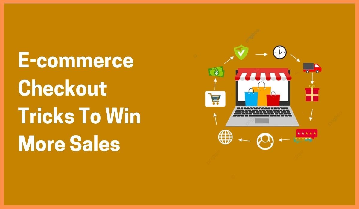
5 Fascinating E-commerce Checkout Tricks To Win More Sales Tactics That Can Help Your Business Grow
Collections 🗒️
If the customers have committed to buy a product. Your duty is to get them through checkout as quickly as possible. Most of the online stores find the best way to reduce the number of steps is to use one-step checkouts. But that one step checkout is not different from five-step checkout. If the one-page checkout asks the same details from the customers.
The only main difference is that the customers have to look more. To ask fewer details from the customers, the checkout will have to take the burden.
According to a report, 27% of US online shoppers dropped their carts due to the complicated and long checkout process.
Here we will see few eCommerce checkout tips on how you can optimize your checkout process. And get a fast conversion rate and sales.
1. Registration
Many eCommerce sites make you register before moving to checkout. This is the reason for cart abandonment. The best option is to provide a “continue as a guest” button and this will take the user to checkout. The accounts get created during the checkout, this looks faster to the customer. You have to also include a sign-in form for the existing users who also want the convenience of fast checkout.

23% of customers will abandon the shopping cart if you will try to force them to create an account.

2. City, state, and Country
Web forms demand addresses in the same format that people write on envelopes. This is something users are familiar with and decreases the chance of errors. However, in today’s world, we can gather info and categorize relationships into tables. This works in a better way to format the fields.
By removing the zip code form to the front of the address entered. We can use info that is already available to us in order to streamline customer input. By using the free lookup tables, a checkout can match the values for the city, state, and country from the zip code. This work is done by checkout. Thus it eliminates the need for customers to type in the information.

3. Clean Layout & Flow
First impressions make an impact on the checkout page. however, a clean and clear checkout page is the first step for having a great checkout experience. The first thing you should do is to remove distractions. A great way to keep your customers focused. You should remove unnecessary links and form elements etc.

Another element that affects the customer’s decision to go further for payment is the checkout form. The fewer elements the checkout form contain. The fewer chances that the customer will complete the order.
So, stick only with the expected fields and save the customer’s time. The customer will have to fill in more fields and will take more time. So try to make the form filling process quick. Apple has a distraction-free checkout page that asks only for essential information.

4. Safe & Trustworthy Payment
There are specific websites where entering your bank account or credit card details is the only way to pay. However, in providing credit card information manually will take time. And everyone hates it.

If you are still thinking about why people love PayPal then it’s because it’s fast. The credit card information of the customer with their shipping address is already saved in PayPal. This will eliminate the need for manually typing the details.

It will be too frustrating every time you buy a new product and you have to enter your credit card info manually. If you are also not accepting PayPal Or Google Wallet on your website. This is the time, you should do it now.
5. One step Checkout
If the customer is committed to buying a product from your website. Your duty is to get them through the checkout quickly. The only mantra to do this is only to ask them little info.
Various eCommerce stores are powered on a hosted solution where you can’t customize the checkout. While shopping carts such as magneto get hosted by the companies that make these solutions. Get switched to a community of the software might give you the flexibility you want. This should be the last alternative. But for having high-grossing eCommerce stores. A 1-10% conversion increase in quarterly sales is something you will need to upgrade.
Magento 2 is the one-step checkout which speeds up the whole shopping process. This will enhance customer satisfaction. You can purchase an extension or get or custom-developed using your developer. Sometimes checkout extensions that are already existing.

What to do about the limitations to simplify your checkouts
- You can create a feature request ticket to your hosted solution’s support system. And tell them that this is a feature you want which directly relates to your store conversion rates. This way there will be dual incentive to make to the next version release.
- You can also move to a self-hosted eCommerce solution. Shopping carts such as Shopify, BigCommerce, and Magento Go are hosted by the companies that make the solutions.

Conclusion
For any type of eCommerce, the checkout process is important. The process has various elements that require lots of tweaking. However, if you do it the right way. You can reduce the cart abandonment problems. You can increase your conversion rate. And finally you will reach your goals. Remember this is all about removing distractions. Try to make the process easy and quickly. To find out what works, you need to customize and test checkout to maximize your conversions.

