How to Improve Landing Page Conversion?

Landing Page is an opportunity for the company to tell the most important thing about their products and services within a few seconds, and for a potential client – to make sure that it has hit “bulls eye”. Besides, it is a powerful tool for converting traffic and generating leads. The complexity of the task increases many times if you make a website that works as a web service that offers an access to software through the Internet (Software as a Service).

Research shows that the average conversion rate for SaaS industry sits around 7%. If your website converts at 7% or higher, you’re doing great. However, if your SaaS website is converting at a rate less than 7%, you need to improve it. To create a high-performing landing page, you need to understand your target audience and design the right sections to communicate your value in a compelling way.
In this post, we'll go over 10 landing page sections that help web pages generate more leads.
Also read: 8 Ways to Toggle SaaS Customer Retention
Must read: How to track customer acquisition in SaaS?
Define your goal
Before you can promote your brand or product to new visitors, you need to define your business goals. Are you looking to generate brand awareness, boost sales for enterprise customers, build an email list from lead generation techniques, or educate your audience in some way?
Each type of goal falls into one of 3 objectives:
- Awareness
- Engagement
- Conversion
You should determine what outcome you’re looking for before you start designing your page. Because the goal you set will help you determine what type of page you need to build.
Identify your target audience
Before you start creating your landing page, you need to understand who your target audience is. Every audience has different characteristics and will need a different approach in order to increase conversion rates. You ultimately need to have “high relevance,” which means you are successfully positioning your page to a specific customer persona. That is: speaking to their pain points, needs, and viewpoints.
Important elements your landing page needs
The hero
According to reports, people often leave web pages within 10-20 seconds of visiting. However, if you can clearly communicate your value proposition, and connect to the reader, you’ll likely convert them from “first impression” to “scrolling the page” to learn more.
The hero section is one most important sections of your site. It’s where you’ll have the opportunity to grab your visitor’s attention and tell them precisely 4 things:
- What you do
- Why you’re different
- What the key benefits are
- How to get started
This is also where the visitor will most likely complete a conversion — or not. This depends on the visitor’s goal and how well your call-to-action responds. That might include informing them of specific results they could find by entering a search or updates they’ll receive after entering their email. Without having a way for visitors to complete a conversion, you’ll miss the opportunity to make effective optimizations to your page.

Airbnb has a simple hero section on their homepage which gives the visitor a clear understanding of what their core value proposition is and how to get started with the service.
Relevant read: Kapture CRM
Must read: Challenges Faced by SaaS startups
Offer decides everything
The first thing that strikes the visitor of a landing page is a heading. It should be made in a beautiful large font, while its content marketing is crucial for SaaS companies. The essence of the title is an offer or a unique trade proposal.
How do you differ from your competitors? What will be valuable to your client? The answer to these questions also gives the offer. Clear, concise, convincing. According to the results of numerous studies, it takes 5 sec for Internet users to decide whether to stay on the page or to leave.
Ideally, the visitor’s reaction should be like: “I finally found it!” The minimum task is to scroll the page to an end.
Here are examples of value propositions from the practice of several SaaS companies:


A bad example: “We will acquire customers via Google Adwords.” The proposal is specific, with a hint of benefit (we’ll bring customers), but it’s painfully standard. No uniqueness.
A better variant: “Setting up Google Adwords with a conversion rate of 4%. Or we return the money.” The value of this offer is the guarantee of a specific result (4% conversion rate) with the condition of a refund. Perhaps, for a given niche, a more accurate offer cannot be invented.
Also read: How to Set Pricing for Your SaaS Product?
Important read: How to validate your SaaS idea before building an MVP?
The signup form
Without leads, you don’t have a business. After you’ve built some initial trust with the visitor, it’s time to ask them to take action and sign up. In the early stages of the customer journey, you might decide to collect information about your visitors to enter them into a process known as “qualification”. This is where you’ll explore specific attributes about the lead to see if they are actually a good fit for your business.
To boost your sign-up conversion rate, you’ll want to offer some form of incentive to the visitor. What sort of value can you give away for free? A lot of marketers will create “lead magnets” with CTA buttons that are positioned to incentivize visitors to sign up for things like a free trial, eBook, checklist, or case study.

Webflow has a simple signup section on their landing pages that speaks directly to the price-conscious visitor who wants to test the product before they buy.
Speak about the client, not about yourself
Put yourself in client’s shoes. What would they like to receive using your product?
Landings with high conversion are not focused only on the characteristics of the company or product, but also on the benefits of the client. Many pages use blocks such as About Us, Our Advantages, Why Choose Us, How We Work.
In approximately this way:

It is often enough to change the title “Why choose us” to “What you get”, “How to help you”. The feeling is completely different. Remember that the buyers, in the long run, do not care about your achievements. They want to satisfy their need.
Develop segmented email drip campaigns
The reality is that 40-60% of your users will sign up for your SaaS product, use it once and never come back. Or they will buy a subscription, but you might struggle with cash flow over the next several years. It cost so much to acquire a customer, but you receive only a small amount of revenue on a monthly basis.
WP Engine sent letters to their customers to get them to upgrade to the yearly plan. This was phenomenally successful for them and improved their signups.

They send a series of highly targeted, plain-text emails to their customers asking them to upgrade. The intent of your email drip campaign is to move your customers up the marketing funnel.
To collect data, you can send an email to subscribers asking for more information. Or, when you get new users to sign up through the landing page, ask them to pick an option that tells you more about them (for example, whether they have used a product like yours before, or the size of their company).
Know more about startups, read: List of Top Mutual Fund Startups
Relevant read: Email writing for Engagement stage
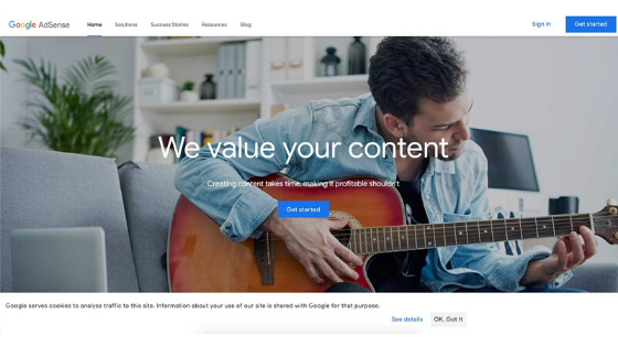
Use only real reviews
One of the best ways to tell a story on your landing page is to provide testimonials from real people who have benefited from your product. Share their unique situation, the problem they faced, and how they overcame it with your solution. The goal here is to inspire your visitors with stories of your past customers. These are real people, sharing real experiences, which your visitors should be able to relate to.

Google AdSense provides a simple photo of a customer and includes a link to a video to learn more. This is a great way to cross-promote your YouTube channel or other social media by telling the same story through a different medium.
Work on CTA
A major part of your landing page that drives conversions is a Call-to-Action (CTA). A CTA makes visitors click. It persuades them to take action. It tells them what they’re supposed to do (next). Make CTA prominent so visitors can easily find it and take action. Make it clutter-free.
Here are few CTA best practices that will help you improve conversion rate:
- Move it above-the-fold. It can increase conversion rate by 20%.
- Make sure your landing page has one CTA. Don’t confuse visitors with multiple CTAs.
- Make it benefit-driven.
- Keep it short and clean.

Here is an example on how making CTA button prominent increased conversion rate by 357%.
Relevant read: The Pros and Cons Of Becoming a Freelancer
Two minute read: All You Need to Know About BankBazaar
The pricing section
One of the biggest objections that new leads will have as they near the closing stage of the buying cycle is price. If you are in the SaaS or eCommerce industry, you’ll save yourself a lot of time by handling those objections up-front.
Including a clear, transparent pricing section can help break down the specs for those visitors who are ready to buy. Even if they still have a few lingering questions, you should be able to get a conversion — if you detail exactly what they’re paying for.
Drift includes a clear two-tier pricing section which shows exactly what features you get on each tier. You can see the monthly prices for each tier and make a decision about whether you need more or fewer features.

Typeform adds an additional option for leads to set the billing interval before they commit to a price. For example, if you wanted to pay for a monthly Pro+ plan on an annual contract with 1 or more users, you’d pay 59 Euro per month.

Frequently asked questions (FAQs)
Even with all the descriptions, demos, visual storytelling, and social proof, people will still have questions and objections to buying. They might have a unique problem they’re not sure you can solve. They might just want to learn more about the product in action. The FAQ section provides a straightforward way to handle these objections directly. Think of this section as a poll. Over time, the questions that continue to come in become the perfect candidates for the FAQ.
Lyft shows a set of common questions about their self-driving project. You can click into each question to read the answer. This helps handle common objections about Lyft’s self-driving car project and makes it easy to see every question clearly.

The “trusty” footer
As an often-overlooked section, the footer can be a great place to instill a sense of security and trust in your visitors. One important aspect of your landing page to always include is a Privacy Policy and a Terms and Conditions page. If you’re an international company, you can also include a language select menu to translate the site.
“Make no mistake,” executives will scroll to the bottom of your start-up’s page to look at your Privacy Policy and evaluate the legal implications before they decide to sign up. This is a subtle optimization which can help you boost your credibility and professionalism.
Slack has a well-optimized footer section including all the links a visitor might need. This section helps visitors build additional trust and feel in control of the page.

Conclusion
- Focus on getting people to convert from the free trial to paid users, as much as you focus on getting website visitors into your trial
- Show, don’t tell. Use images, screenshots, charts, videos and other visuals to reinforce your copy and show visitors how your software solve their problems.
- Continuously sell the outcome and the benefits that come with using your software instead of focusing on the features.
I hope these 10 tips will help you increase SaaS conversion rate. While implementing these tactics will help, you’ll have to test and tweak to get better. There is no end to improvement. There is always room to get better.
Let’s grow your SaaS company. Which one of the trick worked best for you? Please tell us in the comments section.