Best AI Data Visualization Tools: Turn Data Into Insights in Seconds
📚 LearningDiscover the best AI data visualization tools that transform raw data into actionable insights. From dashboards to real-time analytics, find the right tool for your needs.
Within a matter of seconds, AI tools for data visualization can convert messy data into comprehensible, really useful stories.
These systems are really intelligent and spot trends, gaps, and connections that most people may overlook.
There's a drag-and-drop dashboard and simple text or voice prompts available for everyone to dive deep into the data easily, without having to even know about coding.
These tools also recommend the best charts one could use to convey the appropriate message they want to share. All data are updated in real-time and can predict trends.
Benefits of AI Data Visualization Tools
AI visualization tools are not just about charts—they transform decision-making:
- Faster insights: Real-time updates reduce delays
- Better decisions: AI highlights trends and anomalies
- Accessibility: No coding needed
- Collaboration: Easy sharing and dashboards
- Predictive power: Forecast future trends
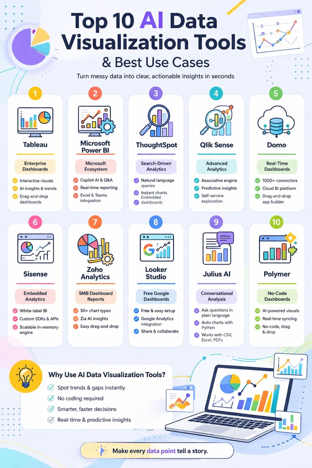
Best AI Data Visualization Tools Comparison
| Tool | Best For | Key Features | Pricing Level | Drawbacks |
|---|---|---|---|---|
| Tableau | Enterprise dashboards | Drag-drop visuals, AI insights, forecasting | High | Complex for beginners |
| Power BI | Microsoft ecosystem users | Copilot AI, real-time analytics | Affordable | DAX learning curve |
| ThoughtSpot | Search-driven analytics | Natural language queries, AI insights | Mid | Needs clean data |
| Qlik Sense | Advanced analytics | Associative engine, predictive insights | High | Steep learning curve |
| Domo | Real-time business dashboards | 1000+ connectors, cloud BI | High | Overkill for small teams |
| Sisense | Embedded analytics | White-label BI, APIs, AI insights | High | Resource heavy |
| Zoho Analytics | SMBs & non-tech users | 50+ charts, Zia AI assistant | Affordable | Slowness on large queries |
| Looker Studio | Free dashboards | Google integrations, templates | Free–Low | Advanced features complex |
| Julius AI | Conversational analysis | AI charts, Python automation | Mid | Privacy concerns |
| Polymer | No-code dashboards | AI insights, real-time sync | Mid | Limited customization |
Tableau
Tableau is a professional tool developed for visualization and processing of raw data and for converting them into clear dashboards for being interactive. This makes data exploration easy through drag-and-drop designs along with many chart options.
Users can easily ask questions in everyday language and get fast answers. Internal artificial intelligence suggests insights, clarifies trends, and weaves together easy narrative threads from the data itself.
Predicting the future is also possible with Tableau, and the application is effortless to work with large and complex data models. Deeply, easily crafted yet quickly executed without the burden of super technical hassle.
Pros
- Powerful interactive dashboards
- Easy drag-and-drop chart building
- Scales for enterprise data
Cons
- Complex for basic users
- Requires infrastructure at scale
Pricing
| Plan | Pricing |
|---|---|
| Tableau Standard | $75/month |
| Tableau Enterprise | $115/month |
| Tableau + Bundle | Contact Sales |
Microsoft Power BI
Microsoft Power BI is a really powerful tool driven by artificial intelligence, which helps people convert raw data into clear insights.
Users can create interactive dashboards, reports, and forecasts by drag and dropping simple visuals, and it has different features, including Copilot, natural language Q&A, smart narratives, and AI visuals, that can speed up and facilitate analysis.
Power BI connects seamlessly with Excel, Teams, and hundreds of data sources. In addition, it provides real-time data reporting, supports very large datasets, and allows custom visuals. Automated insights flag important trends without any manual work.
Pros
- Strong AI features (Copilot, Q&A)
- Deep Microsoft integration
- Frequent updates
Cons
- DAX learning curve
- Best within the Microsoft ecosystem
Pricing
| Plan | Pricing |
|---|---|
| Power BI Pro | $14/user/month |
| Power BI Premium | $24/user/month |
| Embedded | Variable |
ThoughtSpot
With ThoughtSpot, users can visualize and analyze data through simple natural language queries, just like one speaks to a person, thus enabling anyone without deep knowledge of complex SQL or intricate technicalities to use the platform as an answer phrase for immediate visualization as clear charts or live dashboards.
The platform employs AI to automatically identify valuable insights, detect trends or patterns, and make suggestions regarding useful findings.
Teams can slice, dice, and play with a gigantic dataset, create visuals, and share those in real time. Dashboards can be embedded within other apps, making ThoughtSpot completely fitting.
Pros
- Easy search-based UX
- AI-driven insights
- Embeddable dashboards
Cons
- Needs clean data
- Limited chart flexibility
Pricing
| Plan | Pricing |
|---|---|
| Pro | $50/user/month |

Qlik Sense
Qlik Sense is an artificial intelligence-driven analysis and display tool that allows users to perform simple data exploration.
The associative engine lets customers freely search for and navigate relevant data while leveraging dashboards, reports, and interactive apps. Users can very easily assemble charts and KPIs through drag-and-drop.
It is able to process natural language questions, create smart visuals, and provide predictive insights. Strong governance and high-end security make Qlik suitable for large enterprises.
Qlik Sense works in the cloud and on-premises. Rich data connectors and guided storytelling help business users and data teams.
Pros
- Powerful data discovery
- Strong governance
- Rich ecosystem
Cons
- Steeper learning curve
- Not ideal for small teams
Pricing
| Plan | Pricing |
|---|---|
| RFP | Contact Sales |
Domo
Domo is an AI-powered data platform designed to provide a quick, clear understanding. All data visualization, real-time analytics, and dashboards are put into a single cloud system.
It connects with over 1,000 data sources, updating views in real-time. Users can create charts with drag-and-drop tools or low-code features as apps. Teams can embed product and workflow analytics without difficulty.
With AI tools, the result is asking simple questions to obtain new insights to make data feel even more intuitive. The result will be spending less time on reports and more time acting on this ever-fresh data.
Pros
- Real-time analytics
- 1000+ connectors
- Unified platform
Cons
- Occasional bugs
- Overkill for small teams
Pricing
| Plan | Pricing |
|---|---|
| RFP | Contact Sales |
Sisense
Sisense is a data analytics and visualization platform that helps teams convert complex data into an easy, interactive dashboard.
A user can interrogate data in simple language, create meaningful models, and understand trends based upon AI-generated explanations in plain English. Teams can mash up data from various sources, create charts from scratch, and build widgets that suit their needs.
Sisense also lets companies embed fully white-labeled analytics into their products using robust APIs and SDKs. This user-friendly business intelligence is perfect for those companies that look for scalable, embedded BI with advanced capabilities of AI.
Pros
- Strong embedded BI
- High scalability
- Customization flexibility
Cons
- Complex setup
- Resource intensive
Pricing
| Plan | Pricing |
|---|---|
| RFP | Contact Sales |

Zoho Analytics
Zoho Analytics is a highly advanced artificial intelligence and business intelligence analysis and data visualization tool that enables teams to convert their raw data into clear insights with less effort.
It allows users to build interactive dashboards and reports through a simple drag-and-drop tool; there is no heavy coding done here.
It provides more than 50 types of charts with a natural language question requested through Zia, which can create visuals, insights, and written summaries automatically. Users can connect files, databases, and business apps with multiple datasets, and work together very easily through secure sharing.
Pros
- Beginner-friendly
- Affordable pricing
- Strong integrations
Cons
- Slower for big data
- Learning curve for advanced features
Pricing
| Plan | Pricing |
|---|---|
| Standard | $48/month |
| Premium | $115/month |
Looker Studio
In simple words, Looker Studio is a free Google tool for data visualization that helps teams transform raw data into lucid, interactive dashboards and reports in minutes.
It connects to various sources of data, such as Google Analytics, Ads, Sheets, and BigQuery, provides a drag-and-drop editing way of doing things, and has rich chart types such as tables, time series, maps, and scorecards.
As well as link-sharing and creating filters, users can build templates so stakeholders can explore live data in place of static slides. The Pro tier of this solution enables organizations to exercise more admin controls.
Pros
- Free and easy to use
- Strong Google integration
- Good collaboration
Cons
- Hidden costs
- Advanced features complex
Julius AI
Julius AI is a conversational data analyst designed to help users quickly develop insights from data.
You can upload your Excel files, CSVs, PDFs, or Google Sheets and ask questions in plain language. Then the AI takes over: it cleans your data, analyzes it, makes Python charts (without coding), and the users can make tables, regular or interactive charts, and forecasts, as well as animations.
The AI puts the findings in plain English, making numerous insights easy to share. Julius AI is a perfect fit for students, researchers, and business teams that need fast turnaround and accuracy.
Pros
- No coding required
- Advanced visualizations
- Clear explanations
Cons
- Privacy concerns
- Query limits
Pricing
| Plan | Pricing |
|---|---|
| Pro | $45/month |
| Business | $450/month |
| Enterprise | Contact |

Polymer
No-code and powered by AIs, Polymer visualizes data and orchestrates business intelligence. It translates your spreadsheets and connected applications into visually appealing and interactive dashboards in a matter of minutes.
End-users do not have to use cumbersome query languages-they may ask questions in plain language. The AI builds charts, calls out vital insights, and keeps dashboards in tune with real-time data refreshment.
Marketing, e-commerce, and operations teams can all easily hop on data printing. Thus, a timely understanding of results and sharing clean and professional-looking reports becomes possible for them. Polymer eliminates the need for a dedicated data team.
Pros
- No-code dashboards
- AI insights
- Real-time updates
Cons
- Limited customization
- Expensive advanced features
Pricing
| Plan | Pricing |
|---|---|
| Starter | $50/month |
| Pro | $100/month |
| Teams | $250/month |
Final Thoughts
Visualization tools AI offers that visual data really was thinking of better charts, not as static pictures but as living maps of what's high in the moment.
They break the noise, show hidden joins, and put lives into raw figures on which action can be fast-tracked by work teams.
With prompts for humans, with approximate insights, shared dashboards, they urged non-experts onto the very frightening road of the complex data and made them able to do so as confidently as the experts did.
Together, these represent a shift from looking backward at reports with a truly conditional view of real-time.
FAQs
What are AI data visualization tools?
AI data visualization tools are software that use artificial intelligence to turn raw data into easy-to-understand charts, dashboards, and insights. They help users quickly analyze large datasets without manual effort.
How do AI visualization tools improve decision-making?
They analyze data in real time, detect patterns, and highlight trends automatically. This helps businesses make faster, smarter, and data-driven decisions.
Which AI data visualization tool is best for beginners?
Tools like Tableau, Looker Studio, and Zoho Analytics are beginner-friendly because they offer drag-and-drop features, simple dashboards, and easy integrations.
Are AI data visualization tools useful for small businesses?
Yes, they are very useful. Small businesses can track performance, understand customer behavior, and create reports without needing advanced technical skills.