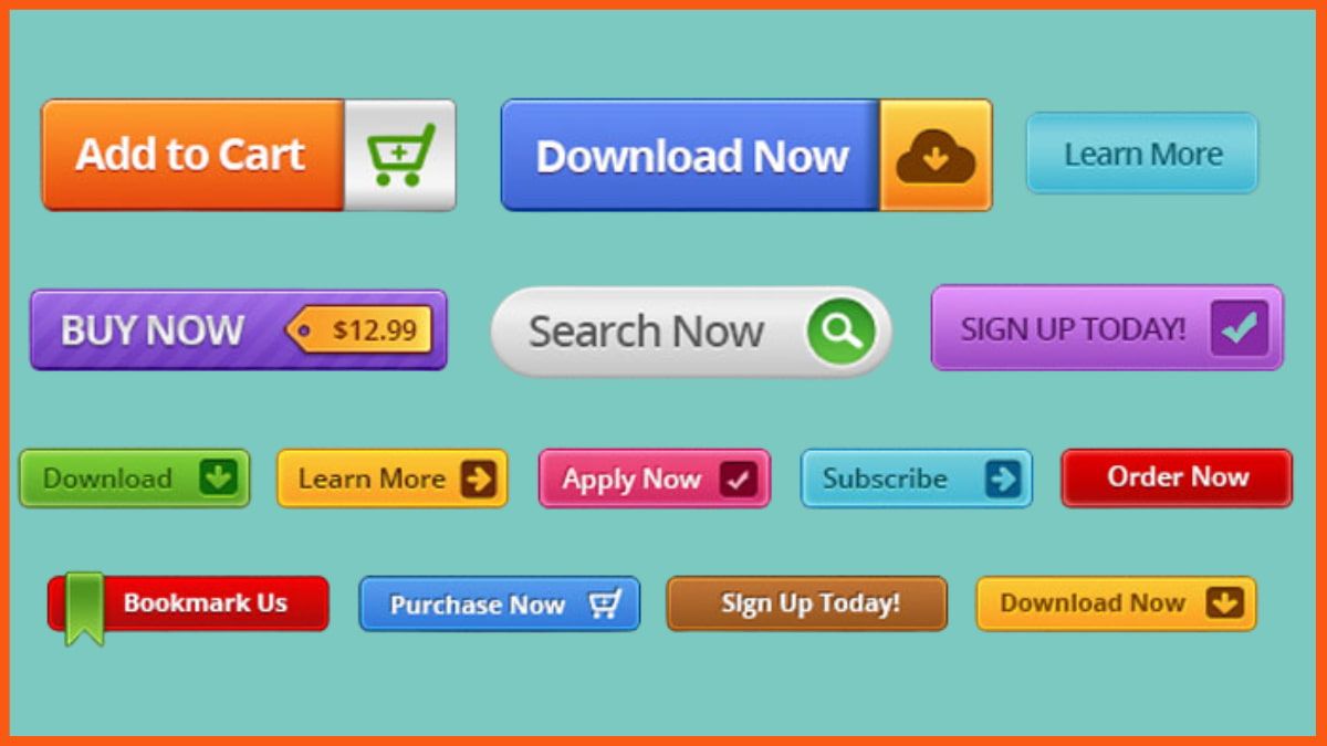
What is a CTA Button? And how to Design The Best Clickable CTA Buttons?
📖 Learning
I am sure, we all have come across many websites that have had a ton of potential and then failed to take advantage of it. One of the most common reasons for this is a lack of attention to details like text size, color, and font.
Clickable buttons are the best way to gain a visitor's attention. This is because they stand out to the user and add a sense of urgency, making it easier for them to click on it. To get more clicks from your Call to Action, CTAs, you must consider the design tricks for creating more visually appealing ones.
An impactful call-to-action button can be a crucial part of your campaign. But having to try out different call-to-action buttons on your site can be an overwhelming experience. There are so many options in the market today and there's no way for us to cover all the bases.
What is a CTA Button?
CTA Buttons as a Marketing Tool
Uses of CTA Buttons
How to Create CTA Buttons?
What is a CTA Button?
CTA stands for call to action button. These buttons are a type of invitation or stipulation for the consumer to guide them on the specific steps to be taken and how? CTA’s are mostly used in marketing emails and landing pages. CTA’s can be a simple text or can be even fancier by using some kind of buttons.
For example, the Zomato emails usually tend to have both types of CTA buttons;
- The read-more acts as a text CTA with a simple hyperlink associated with it.
- And Order Now buttons with more designed and classy button styles and color pallets.
CTA Buttons as a Marketing Tool
Nowadays people tend to insist or believe that no one reads email. However, even today emails have been the best and the top-notch source for communication. This is because what happens is nowadays every technical information or message is conveyed through emails so people tend to check their emails more regularly and seriously than before this can be used as an opportunity to improve marketing.
Statistically, it is also proven that emails generate more sales than any social media. Shockingly right, but it is observed that 60% of people buy a product after receiving a mail from the organization and the remaining 40% of consumers tend to wait for mail regarding a particular offer or sale on the products.
Uses of CTA Buttons
CTA buttons are used from the very start of the email till the very end even in the footer. It can be used for;
- Read More
- Book Now
- Add to Cart
- Scroll To Top
- Discount buttons
- Subscribe
How to Create CTA Buttons?

Here are a few tricks to help you create excellent but even more clickable CTA buttons for your campaigns.
Pick a Primary CTA
It is very essential to wisely select an appropriate Primary CTA, which will standout among the rest CTAs. But, do not overuse it because the use of many CTAs such as read more, subscribe, book now, etc may create a negative impression. It may seem as if you are trying to manipulate the user. This leads to decision fatigue.
Decision fatigue can be said as a phenomenon when the decision-making quality of the person deteriorates after making many decisions.
The primary CTA should be designed differently from others so that it can grab the most attention and convey the main goal of the marketing campaign. Because it is a human tendency, they only focus on the content that grabs their attention in one go.
Choose Good Colors
It's not just about the colors you use. It's also about how you use them. When it comes to CTA buttons, the color palette can make or break your design. And yet, many businesses are still using boring colors and patterns on their CTAs.
It's time to rethink that strategy! There is a lot of psychology behind choosing the right colors for your CTA button—and it all comes down to making your CTA button stand out from the crowd. Are you ready to learn how to pick the perfect color palette for your CTA button?
For the CTA button on your email, you should choose a color that will stand out and have a strong impact.
A good way to do this is by using a nice popping color instead of a dull color. You can use any of the colors from our rainbow palette, but we recommend using one of the following:
- Red
- Orange
- Yellow/Gold
- Green
- Blue/Purple
Positioning
Positioning is an important factor in improving the rate of interaction on a webpage. The main reason for this is that the positioning of the CTA button will determine whether or not people who visit your site are interested in interacting with you.
The key factor in determining if people interact with your company is how easy it is for them to find what they're looking for. If there are multiple CTAs on one page or several CTAs at once, then users might get confused about which button works best for them; if there's only one button at all times (or none at all), then this shouldn't be an issue!
Choose Font
Choosing a font style for your CTA button can help you make it stand out, but it's not just about aesthetics. It's also about making sure that the font you choose is statistically appropriate for your audience. What you're looking for is a font style that has been proven to be read by a large number of people and will have the greatest impact on them.
There are many factors that you might want to consider, such as:
- How many people there are in your target audience
- What age bracket do they fall into
- Their gender
- Their level of language proficiency
- How familiar they are with your brand
If you're looking for something easy to read, try using Helvetica Neue Light or Helvetica Light Condensed. If you want something more unique and eye-catching, try using Arial Black or Cambria Math, these two fonts are both very readable without being overbearing or too busy.
Spacing
When you're creating an online course or any website for organizations, it's important to make sure that your consumer has a clear and easy-to-find path from the email page to where they need to be. A good way to do this is by using clear spacing around the CTA buttons and text that you include on your site.
Using the right amount of spacing around your CTA buttons will help them stand out from your content, and make it easier for students to find them when they're looking for information about your course.
Clickable Buttons
Don't you hate it when you're scrolling through an email and there are no CTA buttons at all? It's like, "What is this? What am I supposed to do?" But what if there were some CTA buttons but they don’t work and even if they work, they didn’t seem to function properly?
A CTA button is a button that links to a specific action or content. They're often used on websites, and they're very important because of how easy it is to click one and go right to the point. To do this, we need to make sure the links are linked properly in the code. Some people may use images instead of text for their buttons but that doesn't work all the time as images with links can be misguiding the viewers.
Conclusion
Design Tricks For Creating More Clickable CTA Buttons has useful information on how to create CTA buttons in a way that looks professional and graphically interesting. So, next time, you design an effective clickable CTA that others can follow without fail. Thanks to this article.
The above is just a selection of ideas to get you started on your own brainstorming session. You are the one who's going to be best at hiding those CTA buttons in the most creative and useful way possible for your users. Now go forth and show them how it's done!
FAQs
What is the full form of CTA Buttons?
CTA stands for Call to action buttons.
What are CTA Buttons like?
CTA Buttons can be simple text or can be even fancier by using some kind of buttons.
How long should CTA Buttons be?
CTA Buttons shouldn't be long. It should be between two to three words.
Should CTA Buttons be attractive?
Yes, CTA Buttons should be attractive enough to catch the viewer's attention.
